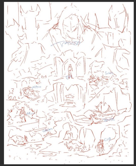
#not sure if this sketch is comprehensible but. ill do my best
Explore tagged Tumblr posts
Visit Tumblr Blog
Explore Tumblr blogs with no restrictions, modern design and the best experience.
Last Seen Tumblr Blogs


Fun Fact
Premium Tumblr themes are available from anywhere between $9 to $49.
Text
*minecraft cave sounds*
#did i ever mention that i really hate working with dark colour schemes#but ah well i cant just not make decked out art#not sure if this sketch is comprehensible but. ill do my best#wip
75 notes
·
View notes
Text
How To Be: Marisa Rosetti (in 4e D&D)
In How To Be we’re going to look at a variety of characters from Not D&D and conceptualise how you might go about making a version of that character in the form of D&D that matters on this blog, D&D 4th Edition. Our guidelines are as follows:
This is going to be a brief rundown of ways to make a character that ‘feels’ like the source character
This isn’t meant to be comprehensive or authoritative but as a creative exercise
While not every character can work immediately out of the box, the aim is to make sure they have a character ‘feel’ as soon as possible
The character has to have the ‘feeling’ of the character by at least midway through Heroic
When building characters in 4th Edition it’s worth remembering that there are a lot of different ways to do the same basic thing. This isn’t going to be comprehensive, or even particularly fleshed out, and instead give you some places to start when you want to make something.
Another thing to remember is that 4e characters tend to be more about collected interactions of groups of things – it’s not that you get a build with specific rules about what you have to take, and when, and why, like you’re lockpicking your way through a design in the hopes of getting an overlap eventually. Character building is about packages, not programs, and we’ll talk about some packages and reference them going forwards.
In my ongoing effort to not just work my way through the entire cast of Ranma 1/2 for February How To Be challenges, spurred in part by not wanting to cover Shampoo since people would get pissy about me pointing out she’s kinda boring and a bit dumb, I have instead decided to reach out to some other source material, seeking an interesting example of a character defined by their ability to fight things, but also wanting something simple enough that I wouldn’t have to do a ton of research, and hopefully from a source material that could afford to be big on personality and a bit stupid.
Ah, Street Fighter, perfect.
Examining Marisa Rossetti
Marisa Rosetti is a character from the Street Fighter universe, introduced in Street Fighter 6. I assume. I’m sure some truly nerdy Street Fighter lore dork will be able to tell me that actually, she was referenced in Street Fighter V Sidestreet Alpha Overlourded, and don’t I look stupid now, everyone is laughing. At a glance, she is a tall muscular Italian lady who, ostensibly, has a day job as a jewelry designer. As a fighter, she uses a hybrid of what you’d see as boxing and wrestling, known as pankration, a martial art about which I know literally nothing. I could read to you from the wiki if you want, but really, we’ve covered the important things.
Marisa also continues the Street Fighter tradition of being a character informed by knowing about one and a half things about a country and then turning the personality slider either all the way up (Zangief) or all the way down (everyone else but especially Ryu). She’s meant to mix together some ideas of Greek and Roman mythology and history in a character who can be best described as a very muscular Asterix comic, complete with the way that she, a woman, looks like a different species to those around her. The character is very much a ‘romantic’ in that she wants to marry everyone who excites her, man and woman, and blurs together Latin and Greek words in her moves. When she’s done beating her opponent up, she m’ladies them off the screen in a polite display, and the character projects this selfserious air of command, where sure, she beat you up, but also, now she may be marrying you. Or something like that.
And look, I know I’m talking some smack here but just because I have nothing but overwhelming disdain for the borderline racist character design philosophy of Street Fighter, I bear no ill will to Marisa here. She is a delightfully exaggerated superhuman, a goofy half-drawn sketch of a design made by someone who had the bravery, the courage to say ‘I don’t really know much about this subject, but damnit, I’m not going to let that stop me, nor am I going to let it spur me on to doing any research.’ Marisa is not defined by her story, in the broad ‘here is how it starts, develops, and ends’ way, but rather the way she bops from encounter to encounter within the violent comedy sitcom of Street Fighter 6‘s b-plots. She’s finding people she wants to fight, because she loves to fight, and she loves the people she can fight with, men, women and even… you.
Glossary Note: Conventionally, the term used in D&D for this mechanical package is race. This is the typical term, and in most conversations about this game system, the term you’re going to wind up using is race. For backwards compatibility and searchability, I am including this passage here. The term I use for this player option is heritage.
The Basics
Overwhelmingly, Marisa is going to be using the multiclass feat Master of the Fist to get access to the Monk unarmed combatant feature, proficient in ki focuses. This is how you can guarantee you’ll be a punchy fighty tall lady. What heritage you pick is going to be flexible around the ability scores you want and what ability scores you want?
Well uh
Strength, probably.
I mean uh.
You know what, let’s talk about Multi Attribute Dependencies.
Fighting games are games that want to represent a character in a tiny window of what they can do. Any given character is cooked down to a small handful of rules about how they move and a few optional abilities. It’s not even ‘how is this character at fighting’ but rather ‘how is this character at fighting in this particular dimension in a learnable way.’ If nothing else, there are some fight game characters who can’t use a gun, which is something pretty important to modern ways of fighting. To this end, you can throw everything you want in the parts of a character’s life that has nothing to do with fighting and it doesn’t change anything. Ryu is a homeless person with combat autism and M Bison owns a multinational corporation and crime syndicate, and those two characters can meet on the battlefield without any discrepancy because all that matters is how well they punch each other with the buttons.
What that means is that when you take these kinds of characters and consider them in the context of an open, complex-interaction world like Dungeons & Dragons (4th edition), in a system that’s meant to deliberately constrain what characters can do in order to ask players to think in terms of parties and specialisations. Turns out you can’t just start out with an international crime syndicate in your back pocket. And this runs down to the ability scores, where a character has six scores that they need to consider in terms of their value to expressing that character.
The thing is, if you look at Marisa as a character in the original text you can make a great case for the fact she should be good at, basically, everything. Sure, she’s not as nimble or dextrous as she is tough or strong, and she might not be a genius, but she has a deeply insightful view of life and relationships, and a personal charisma that lets her roll into people’s lives and express herself immensely. Basically, the only thing she’s not openly good at is book smarts, and even that’s pushing it because this is a woman with a knowledge of art history and historical metalcraft, which are things you don’t just get for free in cereal boxes.
There are plenty of ways to handle this, by the way. Ability scores, ostensibly, are not to necessarily represent what you can do but rather how the person you are expresses itself in ways the games recognise. It’s possible to have a deep awareness of a specific history with training in a skill, and for the rest of your ‘intelligence’ to be wrapped up in that one specific field of study. It’s possible to even diminish an ability like ‘strength’ in the name of increasing something like constitution because in many fights, the ability to push through a hit and score hits is just as likely as being strong enough to push your fists through people’s guards.
This is what we call multiple attribute dependency. Coined a hojillion years ago to discuss the psionics of 3rd edition, it was meant to be an example of a fundamental problem with the class design, where to make a character capable of using the spells, you needed high stats not in an ability, but all of them. This was bad and it sucked. It’s less of a problem here, though, because you don’t need high stats in everything, but you do need to make a choice about what part of Marisa appeals to you the most.
Build 1 — The Brawler Fighter
Probably heritage here is the Goliath, because the ability scores you value are Strength and Wisdom.
I try to always start these things with an as simple as possible pop-the-box-open and go for it character build. To that end, you get an immediately easy build with a level 1 Goliath Fighter who values Strength and Wisdom, and then just picks up fighter abilities that work with that. Take powers that move your opponents, and spend your time grabbing, punching and throwing people. You use an unarmed attack which means you’re getting the full bonus from your Unarmed Combatant feature, and you’re always keeping a hand empty.
Build 2 — The Proud Cavalier
Heritage represents a modest problem here, in that if you go this route, you probably want Strength and Charisma, and that means you probably want either Vryloka (not much support worth having that fits the theme) or Dragonborn (which look like dragons). You can negotiate which of those two options appeals less. If you’re not that concerned about boosting both your important ability scores, you could take the Tiefling route, and, if that’s interesting to you, you can get a little weird with it and take the feat Wrath of the Crimson Legion. At that point, you’re a Charisma-attacking fist-fighter tank whose power riders care about your Charisma, which collapses all the multi-attribute dependency, but also, if you look at a picture of Marisa and think ‘oh, I can junk my strength stat now’ I think you probably don’t actually want what Marisa is bringing to the party. Mechanically, this is cool. Thematically it isn’t on the same planet as her.
Cavaliers are weird. They’re weird because, thanks to drawing on the pool of powers and feats available to the Paladin, they’re quite strong despite being Essentials classes. Plus, they have a lot of power bound up in the mounted companion element, which if you take it, could be something you use to play into the legionnaire element of Marisa. It adds supernaturalism to it, it drives a charismatic edge to the character, and, just, paladins have more stuff to work with. If you want a build that gives you a lot of interesting tools that each are applicable in different ways, Cavaliers are really good.
But it is going to involve coming up with an explanation for how these elements fit together for your Marisa. Basically, if the thing you think that’s most important about Marisa is charismatic brawler, this is where you start, but then you have to answer a bunch of questions afterwards.
Build 3 — The Zippy Battlemind
Heritage here wants Constitution and either Wisdom or Charisma, depending on if you want to play a more debuffing or tough battlemind. Wisdom for toughness, Charisma if you want to debuff. Both Half-Elves and Muls are perfect choices, though I’d suggest the Mul has more of the ‘big and tough’ vibe. Plus they can pick up Dwarf feats, which include some cute tricks in Paragon.
This is the option to go for if what you like about Marisa the most is her insightful wisdom coupled with her super armours that let you walk through attacks. The Battlemind is a class that maximises other people’s turns; after level 7, as a Battlemind, you almost certainly will never be spending your turn doing things only on your own turn. It can have the energy of a character exploiting openings, a fight game character who is really good at seeing windows of opportunity and punching you to ruin your plans.
Junk Drawer
All three of these builds assume you want a Marisa who is a powerful melee defender, because that’s the vibe I get out of this character. I can’t imagine a way to make a leader out of her that doesn’t feel like it’s missing something, and a controller is also at odds with her vibes. But if you want to play a non-defender Marisa, you could go for the Monk itself, and the Ranger can ‘twin strike’ with two punches just as readily as with two swords.
Conclusion
Fighting games are able to represent characters in a particular way. Marisa has a complexity to her that makes her an interesting character to think about and underneath that there’s a ridiculousness that doesn’t need explaining. In this write-up I focused on trying to cover a vibe of a character that didn’t violate the things about her we see, while recognising a complexity in opportunity.
The thing is, Marisa is also just a big chunky lady with silly hair and a tiny head. You can just take her look and use it for anything you find satisfying. There’s nothing saying that to play a character, to play your way of Marisa-ness, you have to do what I’m suggesting here. Remember: This is about showing options in a play space in a game that’s renowned for being limited in its distinctive options.
Check it out on PRESS.exe to see it with images and links!
12 notes
·
View notes
Note
I don’t need a bodyguard! -spacedarcy
@spacedarcy This has taken a while. And it’s not exactly finished…but it’s going somewhere. Modern AU fluffiness. How did I get here?
He’s run through half of his speech for the fifth time that afternoon when a series of short knocks interrupts his train of thought. Muttering a few more lines, he crosses the room, fumbling with the remaining buttons on his freshly pressed, tailored shirt before giving up and opening the door to his suite.
“Oh.” The girl’s head snaps up from chest to eye level so quickly there’s a possibility of whiplash. She’s no less befuddled by his face, it seems, for she asks, “Ben Solo?” as if she expected someone else.
“Yes?”
“You don’t look like your picture. You’re ol…your hair is longer,” she amends in accented English, shaking her head like her mind’s an Etch-a-Sketch and she’s reshaping lines from a new reference. “Sorry. I’m from…”
He’s already pieced it together and finishes her sentence: “From my uncle’s shop.” Ben turns back into the hotel room, waving his hand in a gesture that she should follow him inside. “You can leave the case on the table. I’m sorry he troubled you to bring them.”
He buttons his shirt all the way to the throat, then takes up the ends of his black, silk tie, looping them around with practiced ease, only half watching the knot form in the mounted floor-length mirror. His eyes rest on the girl’s reflection, taking in how her white knuckles continue to clutch the stainless steel briefcase despite his instruction.
“Is there something else?” he asks.
She clears her throat. “Luke didn’t tell you?”
He takes a deep breath. His uncle isn’t the most forthcoming, living like a practical hermit holed away in his shop, surrounded by antiques and relics of eras long since passed. Ben had spent his formative summers roaming through the dusty shelves that smelled of must and decay – it wasn’t a place he visited often, not anymore.
There was nothing to be gained by searching for answers in rare texts and historical artifacts, as his uncle had once wished him to do. Luke had been so focused on looking inward, seeking nirvana through meditative retreats, that he’d forgotten to look around at the suffering of the world. Ben, with his ambassador mother’s influence and his own company’s impressive reach, was determined to do something about it. Global crises required present action and future commitments. It’s why he’d dedicated his life to combining technological advancements with humanitarian efforts.
He smooths the tie against his chest, assessing the final look; he fiddles with the knot. “What is it?”
In the mirror, she shifts her weight from foot to foot in her black flats. Wearing khakis, a white blouse, and a navy blazer that’s too tight in the shoulders and too broad in the waist, she looks like a kid dressed up as an FBI agent for Halloween. Her hair is the only kept thing about her: secured in a low bun that makes her look years older than Ben suspects she actually is.
“I’m attending the event with you.”
Ben’s hands tighten the silk a hair more than comfortable, thrown off by her statement. “Excuse me?”
She brushes her hand next to her ear, though there’s no stray hair to push back. A nervous tick, perhaps. “I’m going along as security.”
He turns and narrows his eyes at her. It’s hard to determine the amount of muscle, or perhaps weapons, hidden beneath the ill-fitting garments. Still, it doesn’t matter. “I don’t need a bodyguard,” he dismisses.
“I’m not–” she starts, then cuts off the thought, as if calculating her approach, trying to gauge how he’ll react even before she delivers her retort. “I’m not here for you. I’m here to ensure these make it back to your uncle.”
He blinks – once, twice. “You’re here to protect my accessories?”
She places the briefcase on the coffee table in front of the loveseat, putting in a combination and scanning a fingerprint to open the latches. The girl turns the case in his direction; inside are a gold watch ringed with an inlay of diamonds, an equally bedecked tie clip, and golden cufflinks in the shape of dice which belonged to his father. She waves her hand over the family jewels like she’s a model on The Price is Right.
“Luke said they’re invaluable,” she reports. “Irreplaceable.”
His uncle may be on to something there, but it doesn’t change Ben’s attitude about having a shadow all evening. Growing up as an ambassador’s son, he’s long since had his fill of someone watching his every step. Then there’s the fact that he doesn’t wish to wear the pieces in the first place; it was only at his mother’s insistence that he agreed, only at the reminder that the award he’s presenting is to honor his late father that he gave in.
“They have more sentimental value than anything else. There’s no reason for you to stay,” he repeats, taking up the watch and sliding it over his wrist.
“With all due respect, Mr. Solo–”
“Ben,” he abbreviates with a wince, finally understanding why his mother hates when people address her as ma’am; he doesn’t want to be a mister anything in this girl’s eyes. “Formalities aren’t necessary.”
Her shoulders set against the friendly shift in his formerly detached tone. She won’t be turned from her duty. “I don’t take my orders from you.”
She’s staring him down more intensely than any sponsor or politician ever has, all over some baubles that his uncle dug out of the Skywalker vault. She looks just as ready to lay him out on the floor as she looks ready to protect him from red-carpet thieves. And, while he wasn’t sure at first, he now believes she’s capable of both.
Ben decides then that he likes her – that even as his exasperation grows, so does his respect.
His curiosity has always been an insatiable thing, and it’s found someone new to whet its appetite. They’ve only just met, but he finds himself with a list of questions on the tip of his tongue. Everything from the mundane, comprehensive where are you from? types to the ones which will synthesize her personal philosophies and life goals into a deeper understanding of who she is. He wants to listen as her dreams fall from her full, pink lips.
Restraint, he scolds himself, tamping down on the romantic notions that pop up suddenly, unexpectedly, while meeting brown eyes that seem to see him, not the founder of a startup so successful that they can hold a celebratory gala. She’s here for a job, not a date.
“Fine,” he acquiesces, sliding the tie clip into place and holding out his hand to her for the cufflinks. “I guess that makes you my plus one.”
An eyebrow stretches tall as she drops the cufflinks into his open palm, then retracts her hand. “Does that actually work for you?”
His neck heats, and he does his best to look sheepish. “What? You’ve been tasked to keep my uncle’s valuables safe, haven’t you Miss…?”
If you want to know her, you should probably start with her name, he thinks belatedly.
“Rey,” she finishes, not backing down from the way he leans forward into her space. She isn’t intimated.
“Rey,” he repeats, drawing the name across his lips slowly. And, just like that, he needs another day – maybe a week – to understand her, to have the opportunity to say her name again and again.
Her eyes go dark, arms crossing over her chest. “I can do my job from the sidelines.”
“Where’s the fun in that?” His grin is a challenge as he secures the cufflinks in place and shakes his wrists to settle his shirt. He moves to the closet and unzips the garment bag holding his suit jacket, then slips into it with a shrug. “I’m only trying to make your job easier, Rey.”
“You are, huh?” She takes a step toward him, closing the distance between them in a bold move that stirs something within him.
“As my guest, you’d be able to keep your eye on…things.”
He nearly says me but chickens out at the last moment. It’s been a long time, too long, since he’s tried to openly flirt with anyone. It’s not something he should be focused on anyway: he should be focused on the queasiness rolling through his stomach at the thought of the speech he has to deliver in a little under two hours.
“Oh, I won’t be letting you out of my sight,” she guarantees, casually pulling the lapels of his jacket closer, as if she’s done it for years. She taps her index finger against the jeweled tie clip. “Alright. You’ve got yourself a plus one.”
“Excellent.” His hand motions up and down in the air, indicating her attire. “Of course, you can’t go like that.”
Now it is her turn to flush with color, though she quickly places her hands on her hips and puffs out her slight chest; it practically grazes his own. In a pointed tone, she reminds him, “I dressed to blend into the background.”
“Something that will be remedied, post-haste,” he assures her.
#reylo fanfic#rey and ben solo#reylo#modern au#fluff#spacedarcy#i accidentally posted this under your other prompt first#so that ask got deleted but I still have it in my docs#because i have ideas for that one too#capaldiwrites
111 notes
·
View notes
Text
Common SEO Mistakes (and How to Fix Them with Design)
SEO is a complex matter and one that web designers and developers might feel is best left to copywriters and search professionals to handle. That makes sense since many common SEO hacks revolve around the manipulation of content and the tagging of it for search.
Here’s the thing though: there are certain choices you make as a web designer that ultimately affect the search-friendliness of your website. Which means you should be involved in the diagnosis and repair of a website’s SEO mistakes.
Repairing SEO Mistakes with Web Design
A click-through rate (CTR) tracking study from Advanced Web Ranking reported the following data, from as recent as September 2018:
What this shows is the likelihood of users clicking on an organic link based on its position in search
As you can see, Google is already stacking the odds against your website by filling its prime real estate with paid listings. That said, the data above is proof that search users are willing to sift through paid promotions to get to the genuinely good website recommendations. The only thing is…
How do you repair a website’s SEO mistakes so it can get to the top of search?
Mistake #1: Non-Responsive Elements
We’re operating in a mobile-first world which means websites have to be designed primarily for that experience. That doesn’t mean leaving desktop users out in the cold, but it does mean dotting your i’s and crossing your t’s to ensure that every element fits within the truncated space of a mobile screen.
Running your website through Google’s Mobile-Friendly Test isn’t enough.
Open your mobile device and walk through every page of your website. Does everything fit between the two edges of your phone? Are the buttons correctly sized and placed? Are images displayed in full and without distortion?
If not, then start here.
Mistake #2: Usability Issues
If we’re talking about usability issues that are severe enough to cause a high percentage of bounces—which communicates to Google that your website isn’t worth ranking—start by looking at the navigation.
Let’s use this one from Hearth Kitchen as an example:
As you can see, the navigation is clearly laid out in a horizontal row. Labels are clear and all pages are present—there’s nothing confusing or hidden. In addition, the header provides users with other information they’d instantly want from a website of this nature.
Since users’ eyes tend to track in a Z-pattern (starting in the top-left and working their way across), your navigation is the first thing visitors see and realistically might be to blame for a lackluster performance in search.
Mistake #3: Low Readability
Although visual content enhances comprehension as well as memorability of what’s on a web page, your visitors eventually need to read the words on it. When that becomes a struggle, websites suffer from short times-on-page and high bounce rates.
Look, you know that your visitors don’t have much of a patience for anything these days. The least you could do is make the reading experience easy for them.
Has your website’s content violated any of these rules?
Typefaces are black (or nearly black) on a white background.
Fonts are in the serif or sans serif families (i.e. be careful with decorative fonts).
The smallest font size should be 16 pixels or larger.
Lines are between 50 and 60 characters.
Paragraphs contain no more than 3 or 4 lines.
Images or lists break up large chunks of content (like I’m doing here).
Headers enables readers (and search bots) to more quickly decipher what a page is about.
WebDesignerDepot does a great job of adhering to these principles, so if you’re looking for inspiration on how to make content readable, start here.
Mistake #4: Bad Pop-Ups
Everyone hates an ill-timed, irrelevant, or pushy pop-up. Google has even gone so far as to penalize mobile websites that utilize what it deems to be bad and intrusive pop-ups.
So, here’s what I’m going to say:
Utilize the least amount of space possible for your pop-ups.
Yotel has a fantastic example of this on its desktop website:
And, if pop-ups need to appear on mobile, relegate them to a top or bottom banner. It keeps your promotional message out of the way.
Mistake #5: Overweight Images
Google rewards websites that are fast—and we’re talking load times under three seconds. While there are a number of things developers can do to get loading speeds under control, designers should look at images to improve performance and SEO.
Specifically, look at file size.
There is only so much room an image can occupy on a website, especially in this age of mobile-first. So, why use a file that’s 12MB when it’s only going to show up as a thumbnail in the site’s news feed?
I’m not saying you should stop using oversized high-resolution images.
Just be sure to resize and run them through a compression software like TinyPNG to ensure you’re not overloading your web server.
Mistake #6: Text Inside Images
There are two reasons why text inside images is a bad idea for SEO. The first has to do with readability.
Think about what happens when text is laid atop an image. If there’s a distinct contrast between the two, readability should be fine. But what if text is placed over an otherwise mundane part of an image on desktop? On mobile, it shrinks down and may end up appearing over a busier and more distracting part of the photo.
Then there’s how the text is added. If text is pasted into an image file, search bots won’t be able to detect it. If your copywriters wrote that particular string of text with a search keyword embedded in it, you’ve just removed it from Google’s view.
Instead, you should work with your content management system to add text using custom fields meant to go on top of images.
In my opinion, it’s best to stay away from text on images unless you can ensure uncompromized readability and that Google bots can read it. Culture Trip shows how this can be done:
It also has links lower on the page where the text is removed from the photo altogether (which I think looks even better):
Mistake #7: Lack of Trust Marks
The last mistake has to do with security. This is something Google cares about greatly, but a lot of it falls to a web developer to implement.
To do your part, find opportunities to include trust marks to boost the confidence of visitors as they travel around your website. Uncommon Goods includes a number of these at the bottom of the site:
Trust marks may differ based on your website’s business type, but they do exist. Anti-malware software. SSL certificate. Secure payment gateway. These are the kinds of symbols that put your visitors’ minds at ease and allow them to stay longer and convert.
Wrap-Up
Now that you know some of the more common SEO mistakes caused by web design, be sure to account for them in your workflow going forward. You’d be amazed what improved performance, security, and usability will do for a website’s ranking!
Add Realistic Chalk and Sketch Lettering Effects with Sketch’it – only $5!
Source from Webdesigner Depot https://ift.tt/2Qv6NET from Blogger https://ift.tt/2GgM0QZ
0 notes
Text
Common SEO Mistakes (and How to Fix Them with Design)
SEO is a complex matter and one that web designers and developers might feel is best left to copywriters and search professionals to handle. That makes sense since many common SEO hacks revolve around the manipulation of content and the tagging of it for search.
Here’s the thing though: there are certain choices you make as a web designer that ultimately affect the search-friendliness of your website. Which means you should be involved in the diagnosis and repair of a website’s SEO mistakes.
Repairing SEO Mistakes with Web Design
A click-through rate (CTR) tracking study from Advanced Web Ranking reported the following data, from as recent as September 2018:
What this shows is the likelihood of users clicking on an organic link based on its position in search
As you can see, Google is already stacking the odds against your website by filling its prime real estate with paid listings. That said, the data above is proof that search users are willing to sift through paid promotions to get to the genuinely good website recommendations. The only thing is…
How do you repair a website’s SEO mistakes so it can get to the top of search?
Mistake #1: Non-Responsive Elements
We’re operating in a mobile-first world which means websites have to be designed primarily for that experience. That doesn’t mean leaving desktop users out in the cold, but it does mean dotting your i’s and crossing your t’s to ensure that every element fits within the truncated space of a mobile screen.
Running your website through Google’s Mobile-Friendly Test isn’t enough.
Open your mobile device and walk through every page of your website. Does everything fit between the two edges of your phone? Are the buttons correctly sized and placed? Are images displayed in full and without distortion?
If not, then start here.
Mistake #2: Usability Issues
If we’re talking about usability issues that are severe enough to cause a high percentage of bounces—which communicates to Google that your website isn’t worth ranking—start by looking at the navigation.
Let’s use this one from Hearth Kitchen as an example:
As you can see, the navigation is clearly laid out in a horizontal row. Labels are clear and all pages are present—there’s nothing confusing or hidden. In addition, the header provides users with other information they’d instantly want from a website of this nature.
Since users’ eyes tend to track in a Z-pattern (starting in the top-left and working their way across), your navigation is the first thing visitors see and realistically might be to blame for a lackluster performance in search.
Mistake #3: Low Readability
Although visual content enhances comprehension as well as memorability of what’s on a web page, your visitors eventually need to read the words on it. When that becomes a struggle, websites suffer from short times-on-page and high bounce rates.
Look, you know that your visitors don’t have much of a patience for anything these days. The least you could do is make the reading experience easy for them.
Has your website’s content violated any of these rules?
Typefaces are black (or nearly black) on a white background.
Fonts are in the serif or sans serif families (i.e. be careful with decorative fonts).
The smallest font size should be 16 pixels or larger.
Lines are between 50 and 60 characters.
Paragraphs contain no more than 3 or 4 lines.
Images or lists break up large chunks of content (like I’m doing here).
Headers enables readers (and search bots) to more quickly decipher what a page is about.
WebDesignerDepot does a great job of adhering to these principles, so if you’re looking for inspiration on how to make content readable, start here.
Mistake #4: Bad Pop-Ups
Everyone hates an ill-timed, irrelevant, or pushy pop-up. Google has even gone so far as to penalize mobile websites that utilize what it deems to be bad and intrusive pop-ups.
So, here’s what I’m going to say:
Utilize the least amount of space possible for your pop-ups.
Yotel has a fantastic example of this on its desktop website:
And, if pop-ups need to appear on mobile, relegate them to a top or bottom banner. It keeps your promotional message out of the way.
Mistake #5: Overweight Images
Google rewards websites that are fast—and we’re talking load times under three seconds. While there are a number of things developers can do to get loading speeds under control, designers should look at images to improve performance and SEO.
Specifically, look at file size.
There is only so much room an image can occupy on a website, especially in this age of mobile-first. So, why use a file that’s 12MB when it’s only going to show up as a thumbnail in the site’s news feed?
I’m not saying you should stop using oversized high-resolution images.
Just be sure to resize and run them through a compression software like TinyPNG to ensure you’re not overloading your web server.
Mistake #6: Text Inside Images
There are two reasons why text inside images is a bad idea for SEO. The first has to do with readability.
Think about what happens when text is laid atop an image. If there’s a distinct contrast between the two, readability should be fine. But what if text is placed over an otherwise mundane part of an image on desktop? On mobile, it shrinks down and may end up appearing over a busier and more distracting part of the photo.
Then there’s how the text is added. If text is pasted into an image file, search bots won’t be able to detect it. If your copywriters wrote that particular string of text with a search keyword embedded in it, you’ve just removed it from Google’s view.
Instead, you should work with your content management system to add text using custom fields meant to go on top of images.
In my opinion, it’s best to stay away from text on images unless you can ensure uncompromized readability and that Google bots can read it. Culture Trip shows how this can be done:
It also has links lower on the page where the text is removed from the photo altogether (which I think looks even better):
Mistake #7: Lack of Trust Marks
The last mistake has to do with security. This is something Google cares about greatly, but a lot of it falls to a web developer to implement.
To do your part, find opportunities to include trust marks to boost the confidence of visitors as they travel around your website. Uncommon Goods includes a number of these at the bottom of the site:
Trust marks may differ based on your website’s business type, but they do exist. Anti-malware software. SSL certificate. Secure payment gateway. These are the kinds of symbols that put your visitors’ minds at ease and allow them to stay longer and convert.
Wrap-Up
Now that you know some of the more common SEO mistakes caused by web design, be sure to account for them in your workflow going forward. You’d be amazed what improved performance, security, and usability will do for a website’s ranking!
Add Realistic Chalk and Sketch Lettering Effects with Sketch’it – only $5!
Source p img {display:inline-block; margin-right:10px;} .alignleft {float:left;} p.showcase {clear:both;} body#browserfriendly p, body#podcast p, div#emailbody p{margin:0;} Common SEO Mistakes (and How to Fix Them with Design) published first on https://medium.com/@koresol
0 notes